Student Roadmap - Visualizing and Analyzing Data
Look for Trends and Patterns

The data you collected as you did your experiment are called your “raw data.” Sometimes, just by looking at the raw data, you can see trends. For instance, in studying plant growth and recording how tall a plant is every day, you might see a steady increase over time. But you might also notice that there were periods when the plant’s height was not changing much. Did that period of slow growth correlate with the 4-day weekend when you weren’t able to water them?
So, dig out all of your team’s data and let’s take a look. Did you set up a data plan before you started collecting data? If so, you’ve got a headstart on organizing your data.
Why does it matter what my data tables look like if the data are all there?
Organizing your data into tables, and then using those tables to create charts and graphs helps you to make sense of the data and find patterns in the data. Well designed tables, charts, and graphs can help you convince others that your conclusions are backed up by evidence.
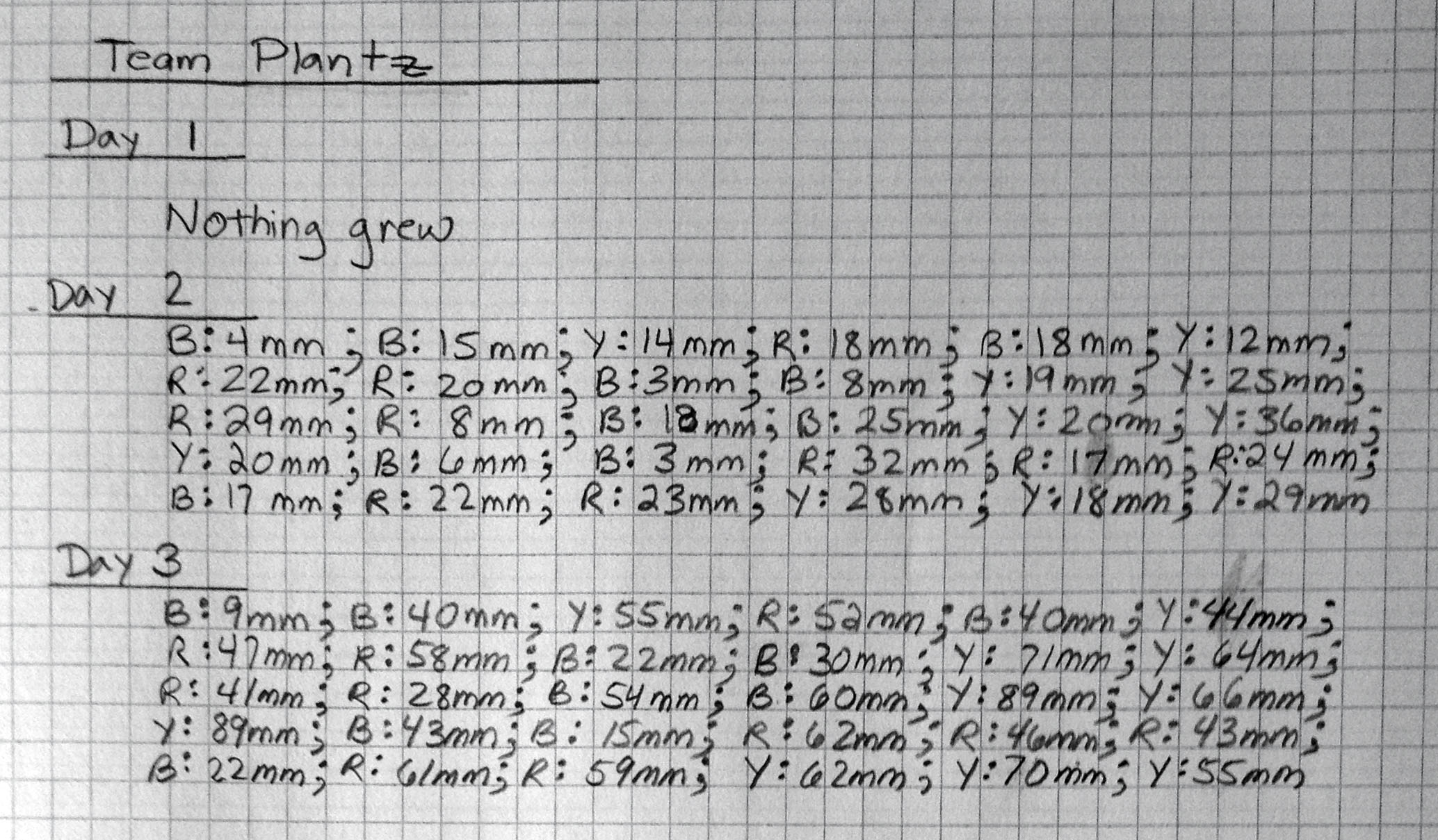
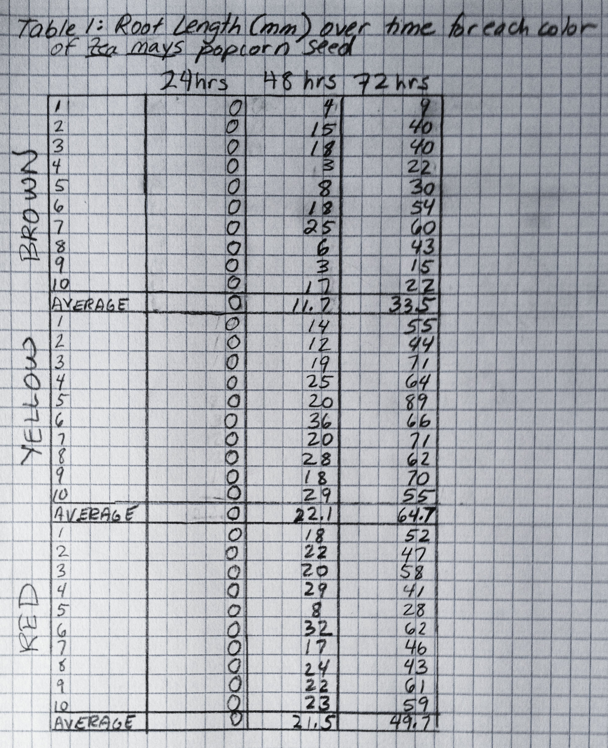
The first step to making sense is to put your data into a form that makes seeing patterns easier. Let's look at the data from team PLANTZ. This team’s question is whether the yellow, black, and red seeds from multicolored popcorn sprout and grow the same way.
Team PLANTZ germinated their corn seeds on a wet paper towel and are measuring the germination rate (% of seeds that sprout) and root length of each sprout each day. They predict that the germination rate and growth will be the same for all the different colors. Here are two different ways they could share the data with you. Which is most helpful? As you look at the examples, try to figure out if the growth is the same. If it isn’t, which color seed has the longest roots?
Option 1:  |
Option 2:  |
Graphs and Charts

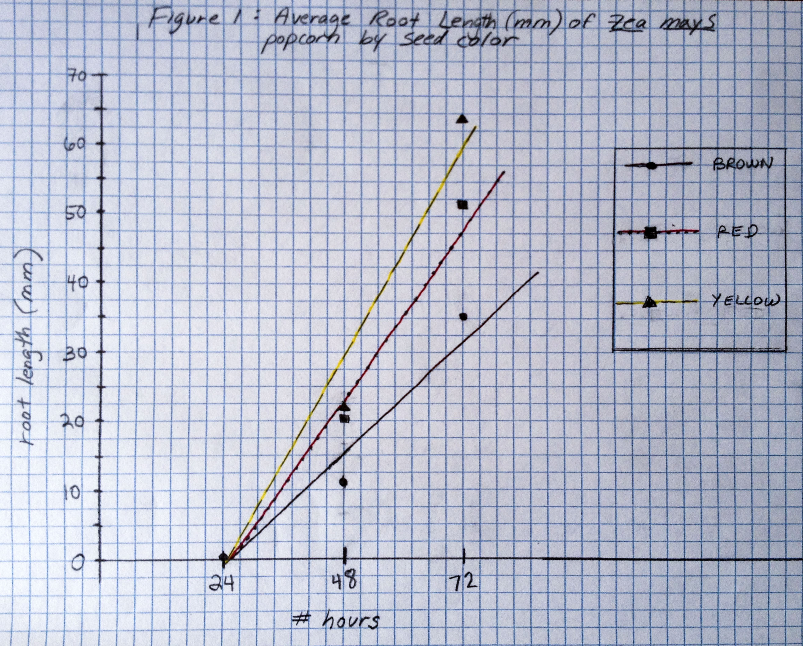
One of the best ways to display data trends is by using graphs and charts. Here is a line graph of the data presented in tables above. Is it easier to see what is going on now?
Based on the graph, what can team PLANTZ conclude about their seeds?
- a. there was no difference in the germination rate (% of seeds that sprouted) in the different colors of popcorn
- b. after 3 days, the yellow seeds grew longer roots than the brown seeds, with the red seeds somewhere in the middle.
- c. the reason the roots grew to different lengths has to do with the color of the seeds and no other variable.
Hint: You'd need more than the graph alone to make one of those conclusions…if you were a mentor, which one of those conclusions would you want to see more support for?
Labeling graphs
By convention, the horizontal axis, or the “x” axis, is where the independent variable is plotted. The vertical axis, or the ”y” axis is where the dependent variable (the measurement data) is plotted.
It's really important to label your graphs so that anyone can tell just by looking at the graph what it is supposed to be showing. Don't forget to label the axes, and include the units of measurement (hours?millimeters? centimeters?) for each one.
Typically, scientists don't connect the dots on line graphs. Instead, usually they draw a "best fit" line or smooth curve through the data points to show the trend of the data. If you have questions about how best to draw lines on your line graph for your particular data, ask your mentor for advice.
How Do I Deal with Multiple Trials or Multiple Replicates?
Best practices for data tables
- Think about the data you’ll collect and how to display them before you start collecting data. Make a chart to fill in when the investigation starts.
- Label columns and rows well.
- Arrange your data so that it is easy to see patterns.
- If you have multiple trials or replicates, include the average of the values.
You collected data on more than one plant right? The information summarized in the graph usually represents an average of the values.
What Kind of Graph or Chart Should I Use?
The kind of graph you choose to make depends on the kind of data you collect and what you want to show. Lines, dots, pies, bars --all of these are useful graphing tools.
Here's an online tool to help you decide which kind of graph to use.
Don't hesitate to ask your mentor for advice about the kind of chart to use. They can help steer you in a good direction. Or, try making a few different charts and see what works the best to make your point.
Adding Statistics: Testing Significance, Adding Error Bars, and Other Advanced Topics
If you are in an advanced biology class, you may be wondering where the error bars on the graphs are, or how to go about seeing if differences in your data are significant. These are important topics that biologists and other scientists must consider when they work with data. For more information, and how to calculate error bars and significance, see our Plant Toolkit: Using Math